Rowing Academy - Visual Identity
2026
This project revisits the Mtskheta Rowing Academy from a new perspective. Having previously designed the facility’s architecture, I returned to the project to establish its graphic identity, shifting focus from physical space to visual communication.
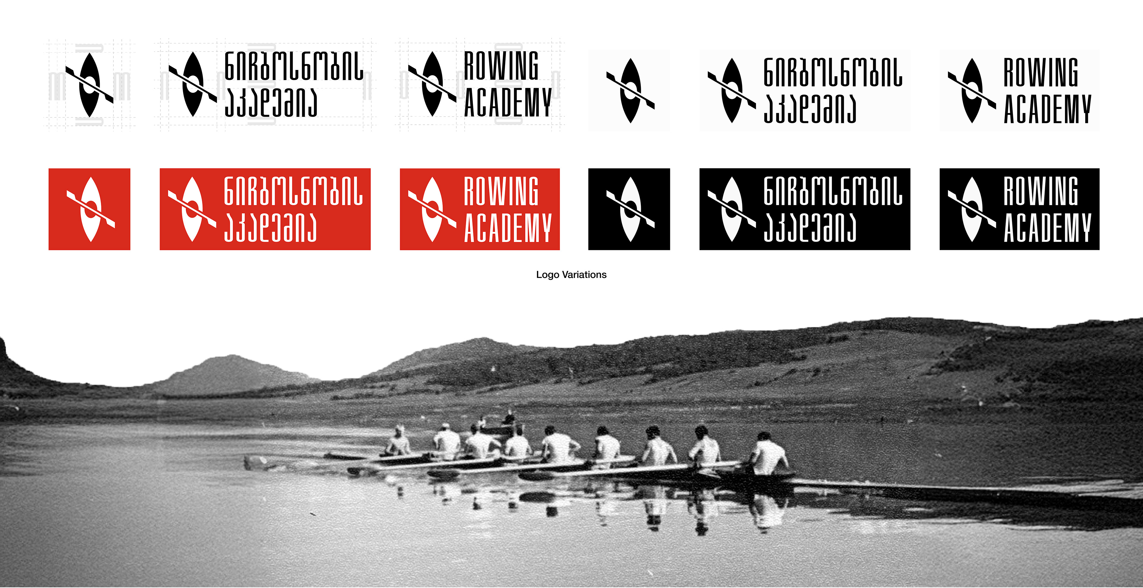
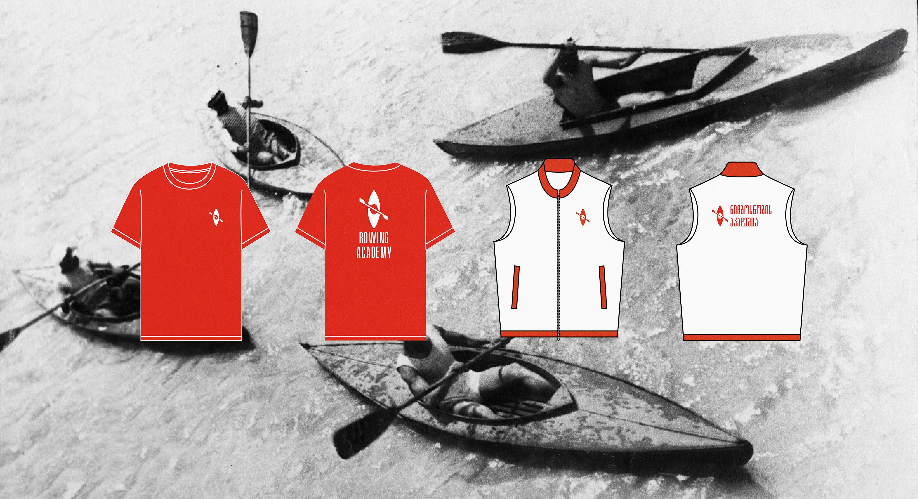
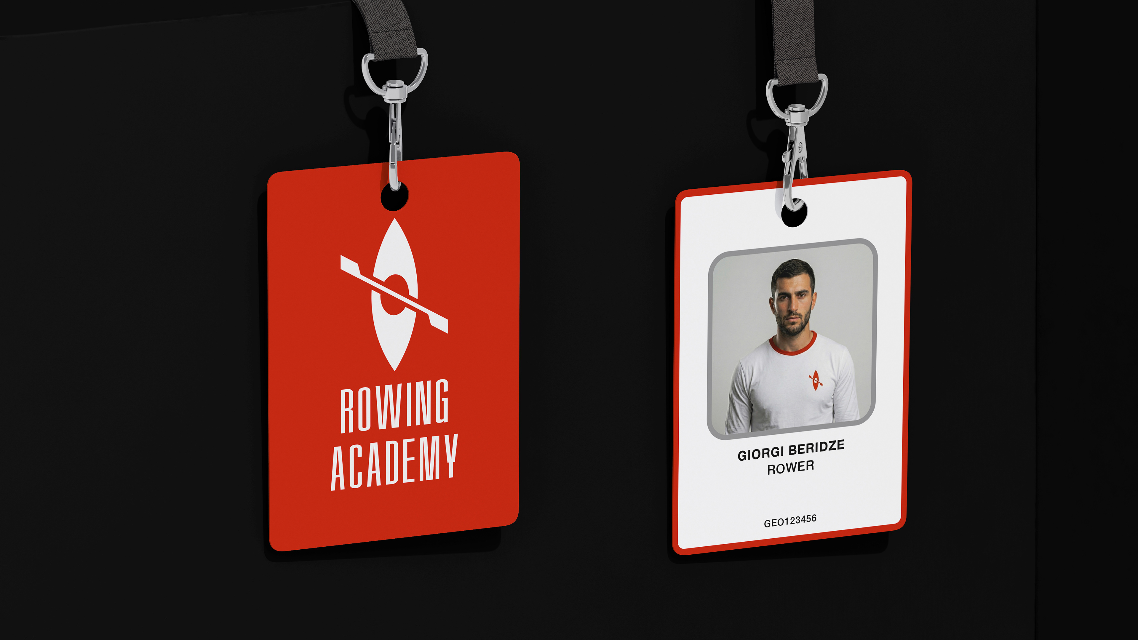
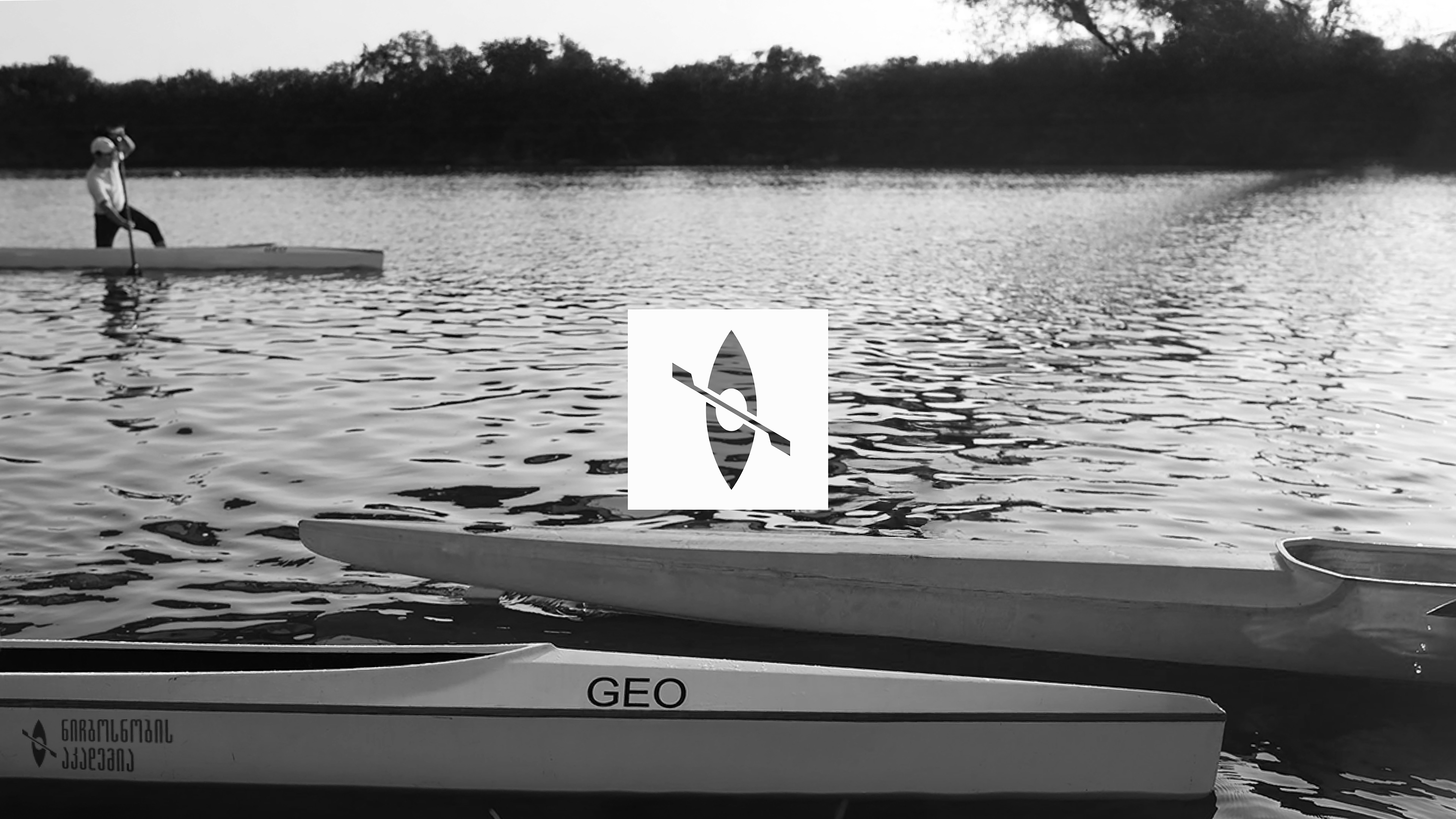
In Georgia, the National Federation governs both Rowing and Kayaking. The academy in Mtskheta is a multi-discipline water sports hub. Therefore, the branding icon was designed as a hybrid symbol - combining the hull shape of a kayak with the geometric precision of rowing - to represent the unified water sports community on the Mtkvari River.
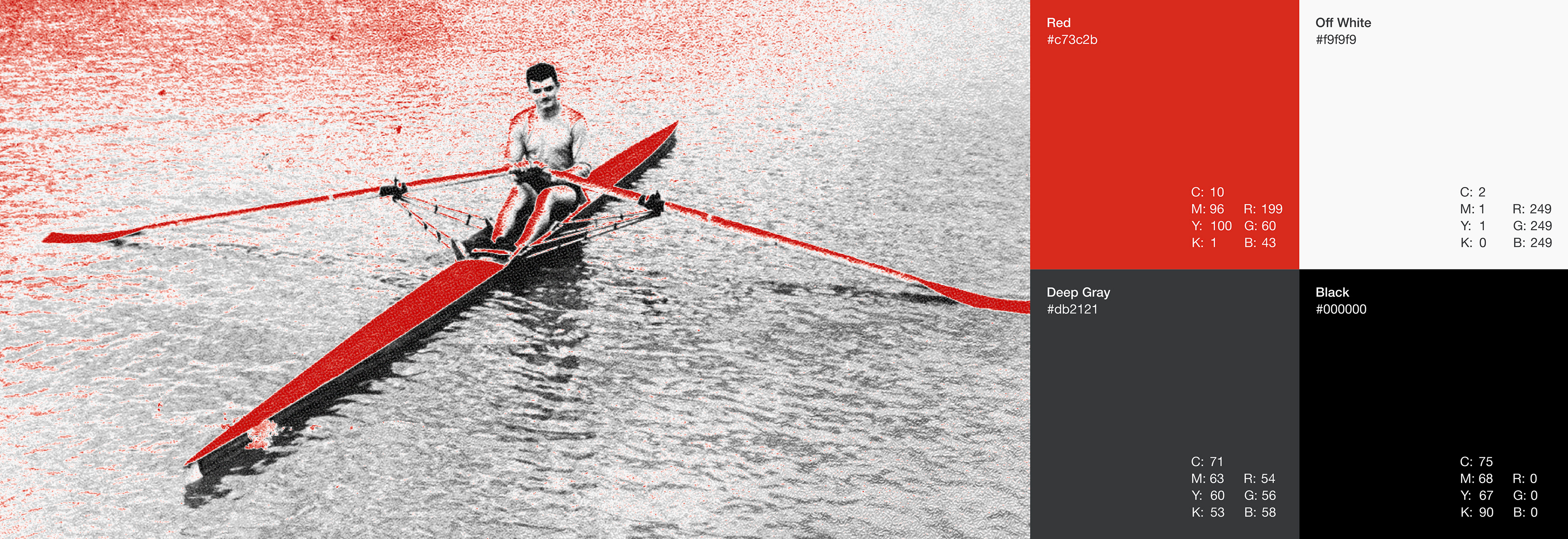
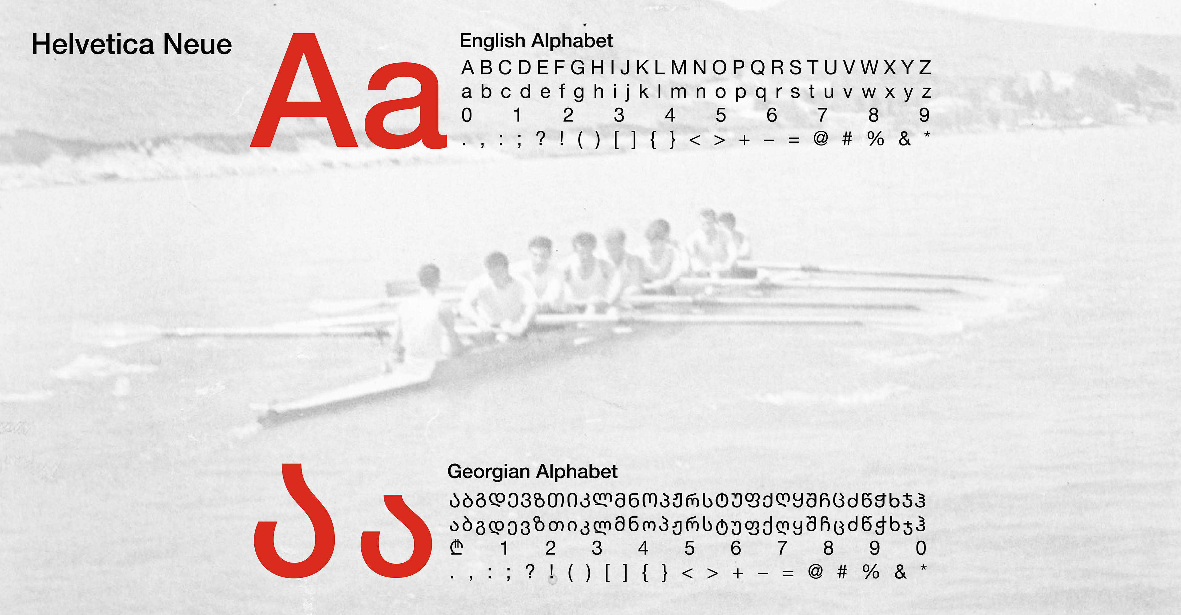
The resulting system is built on a strict construction grid and features a custom bilingual typographic lockup, harmonizing the Georgian script with the English alphabet. A high-contrast palette of Red and Black ensures the brand remains visible and distinct across all applications.