Tbilisi Transport - Visual Identity Redesign
2025
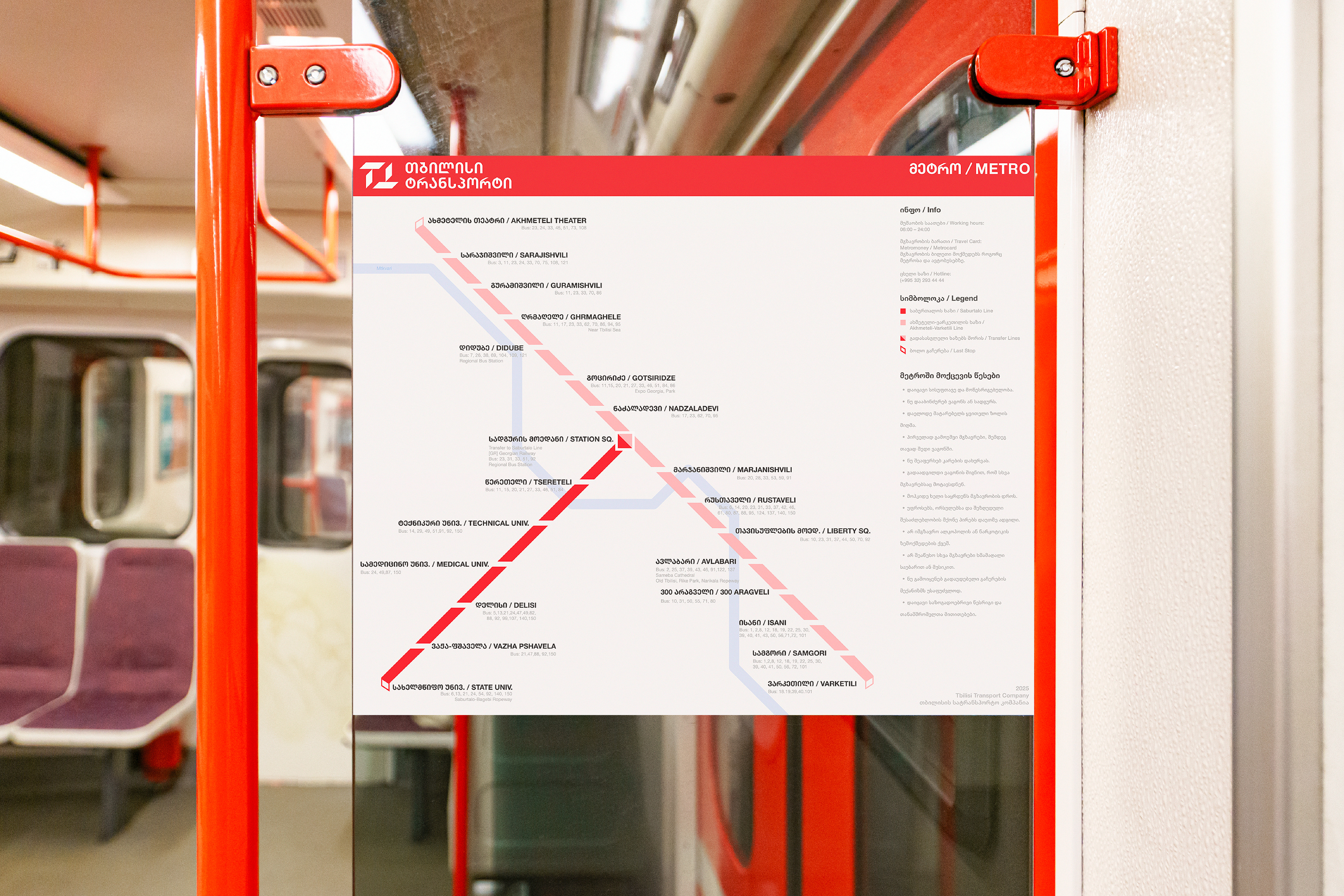
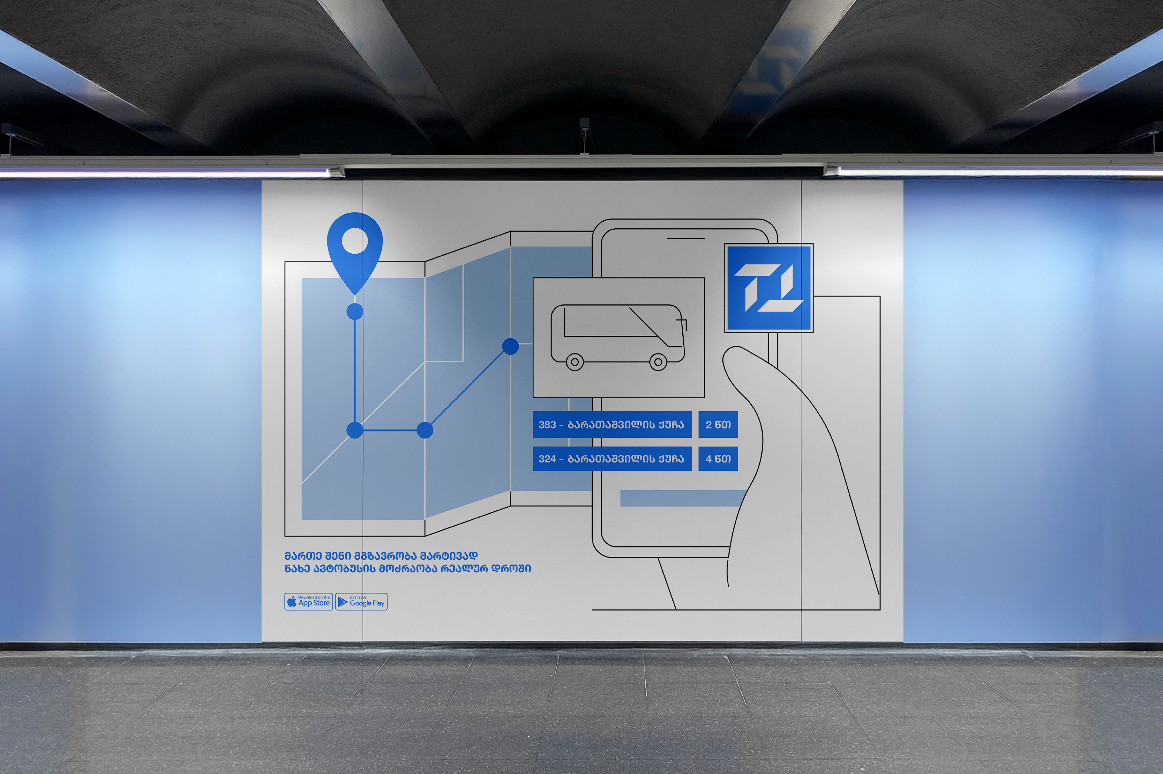
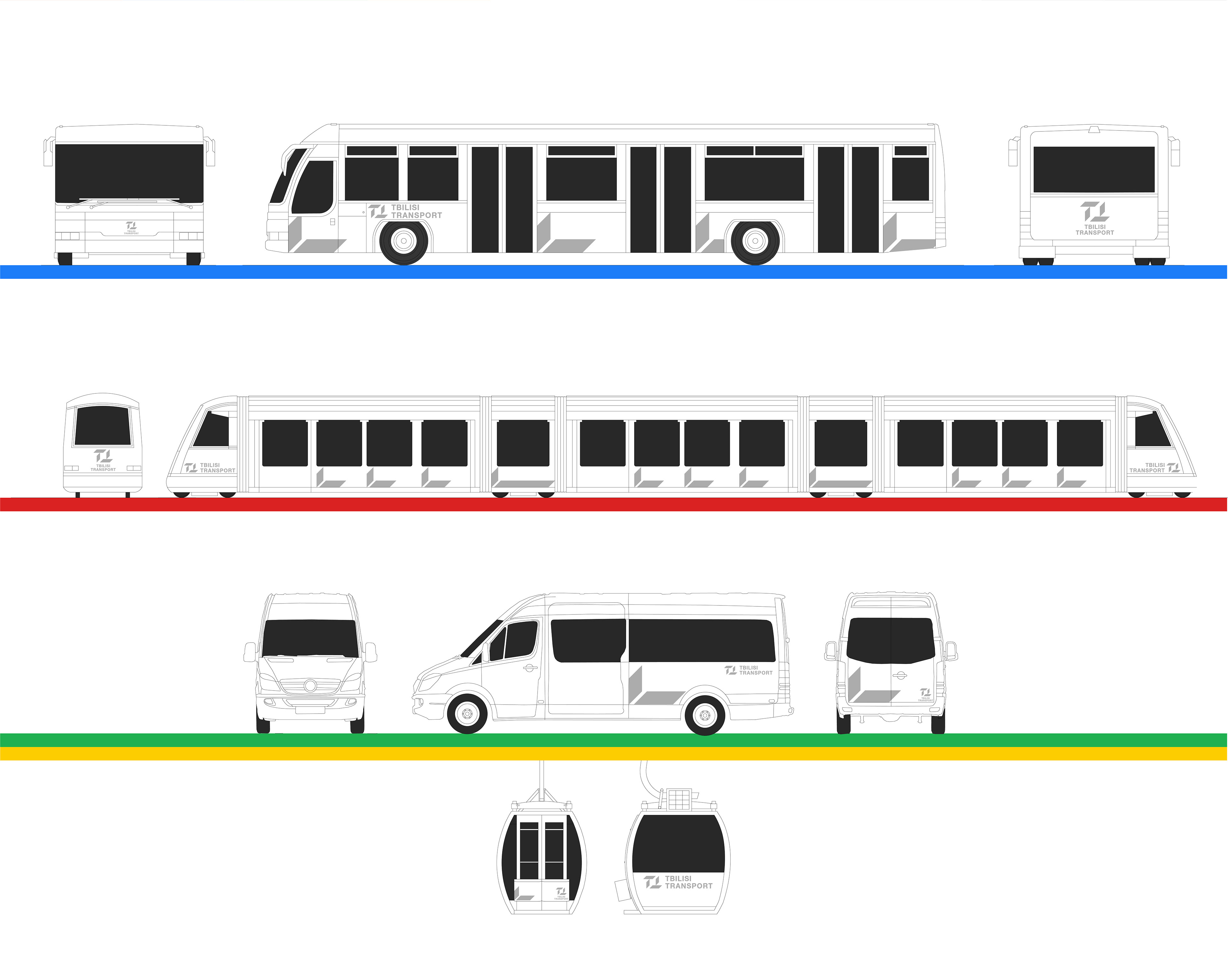
This project reimagines the visual identity of Tbilisi’s public transport system, aiming to bring clarity, consistency, and a sense of movement to the city’s everyday travel experience. The goal was to create a unified design language that connects buses, metro, cable cars, and minibuses into one recognizable system.
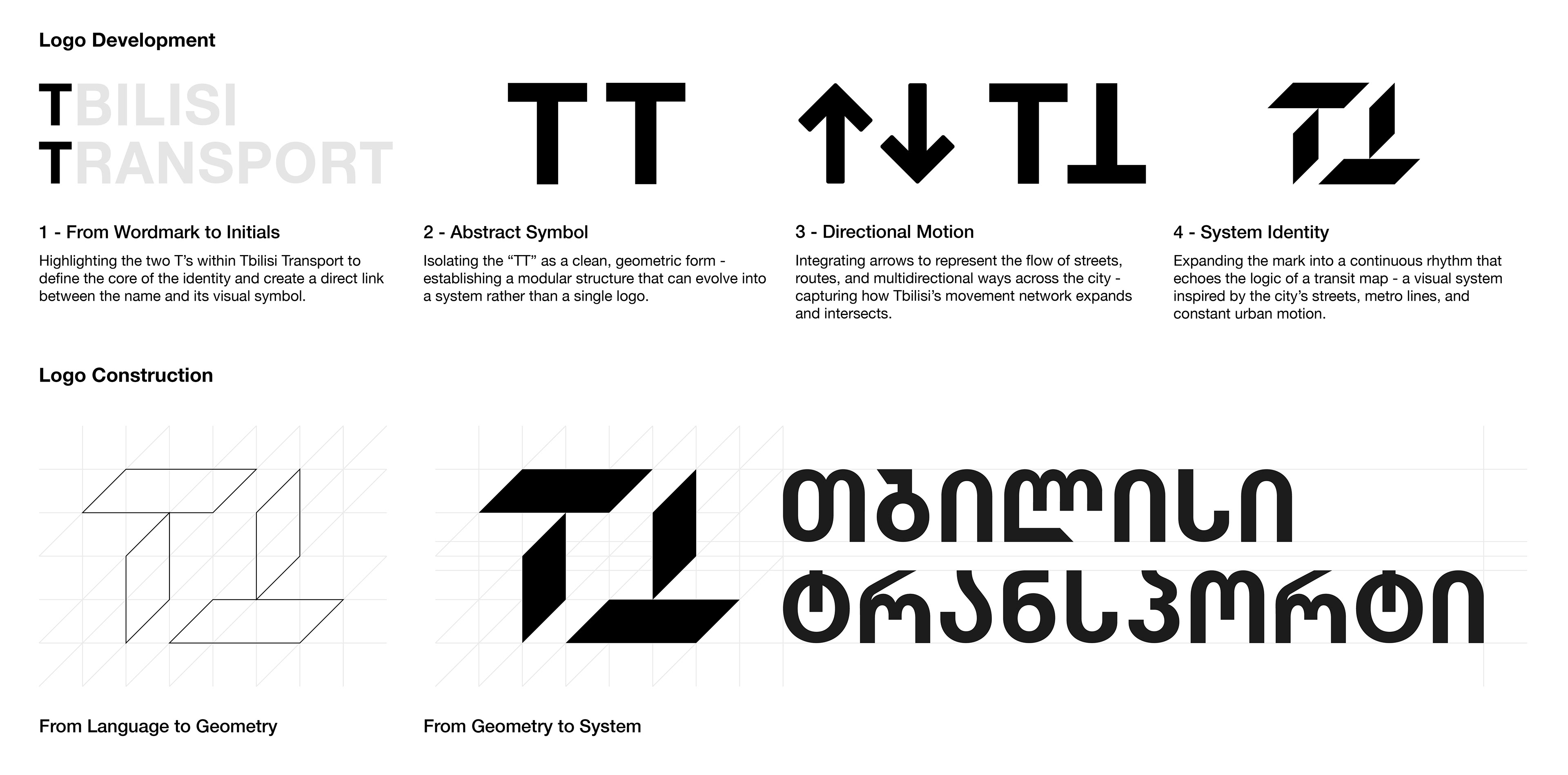
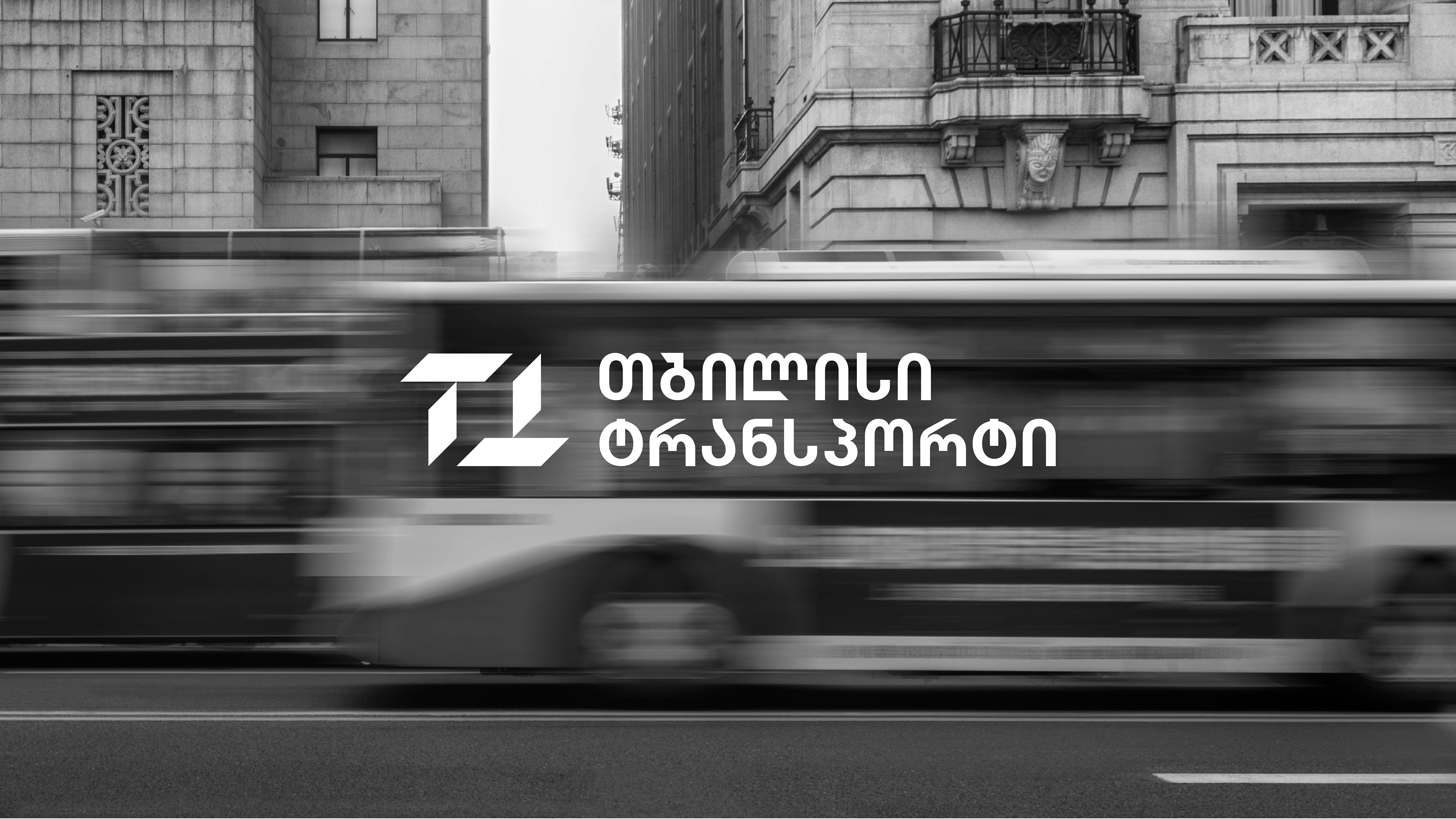
The new identity begins with the name itself - Tbilisi Transport - and highlights its initials, “TT,” as the foundation for the entire design. Through abstraction and geometry, the letters transform into a modular, directional symbol-inspired by the rhythm of streets and the intersections of routes across the city.
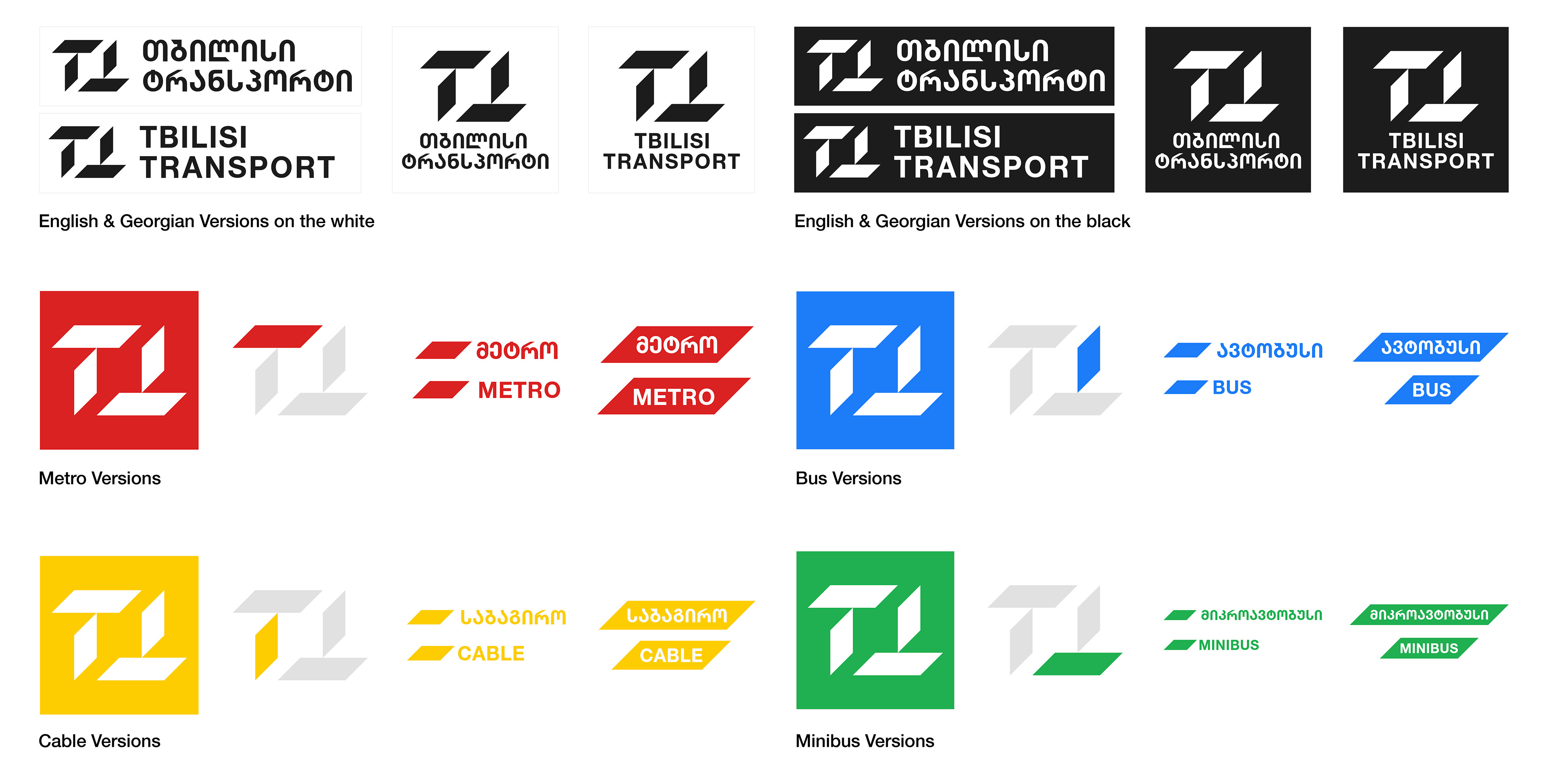
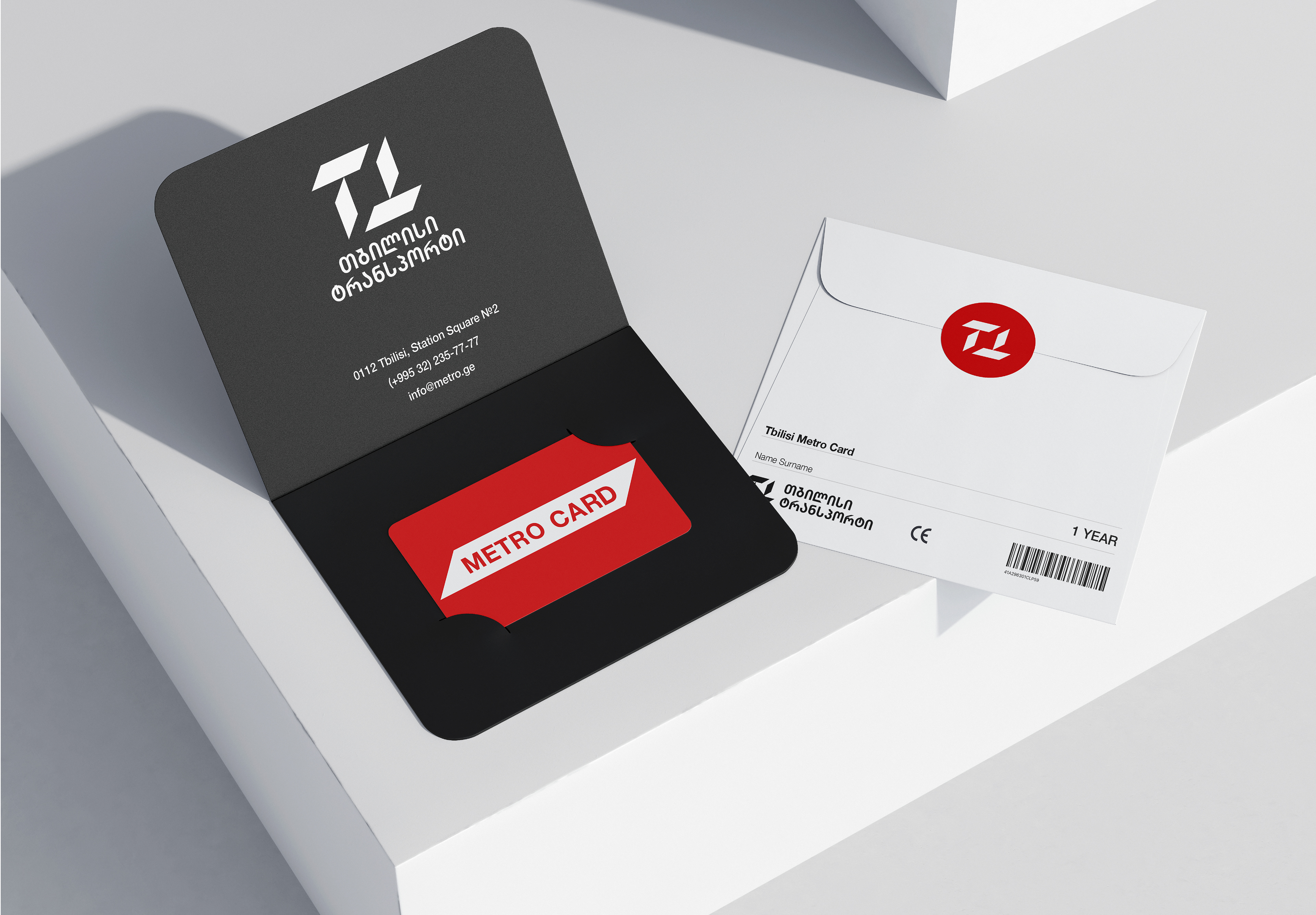
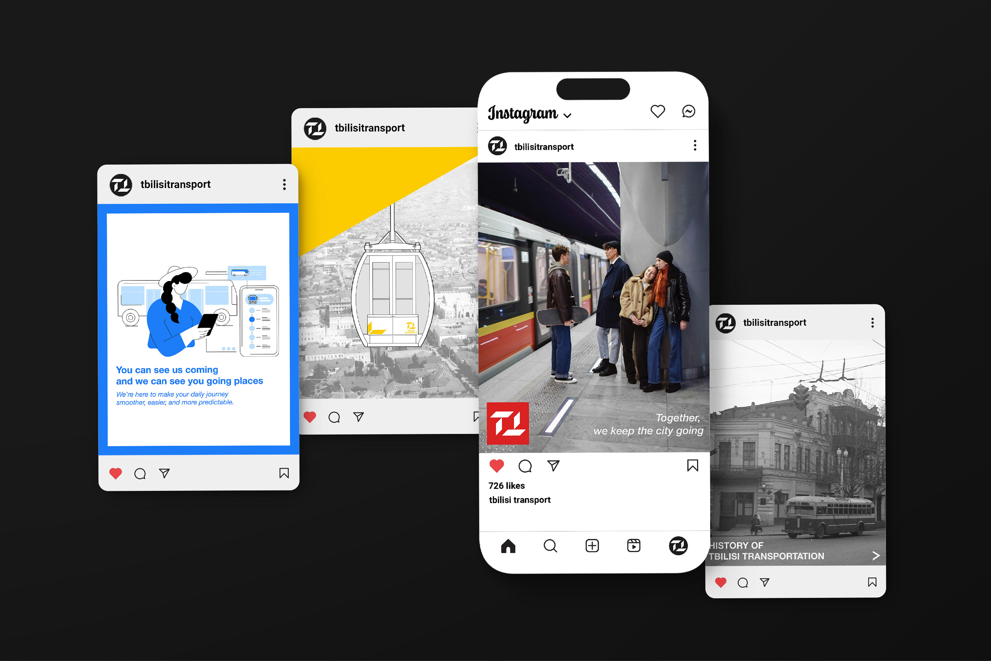
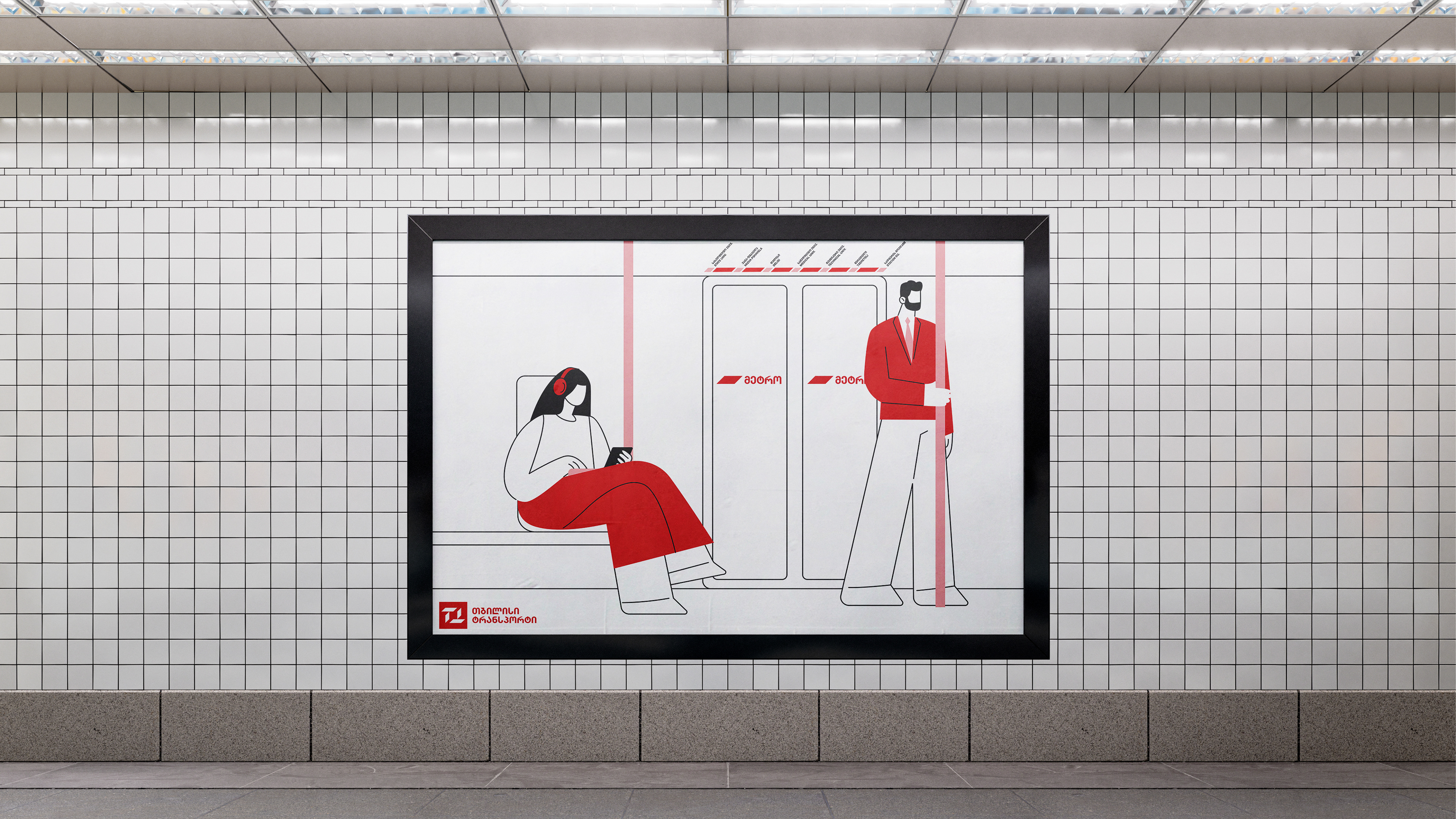
Arrows and flowing forms were introduced to represent motion, direction, and connectivity, turning the logo into a dynamic system rather than a static mark. The design expands beyond a single logo to form a flexible graphic framework adaptable across multiple platforms - from signage and vehicles to maps and digital spaces.
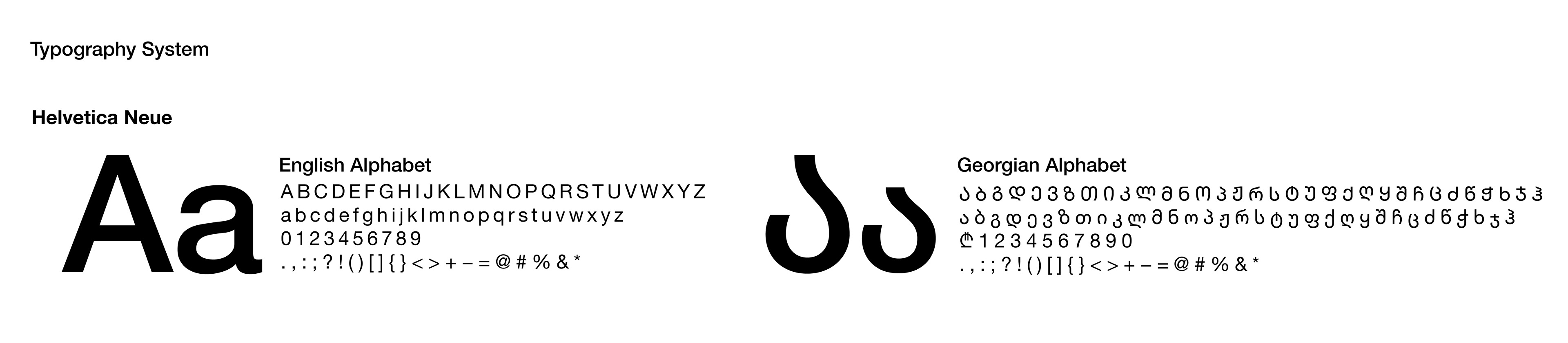
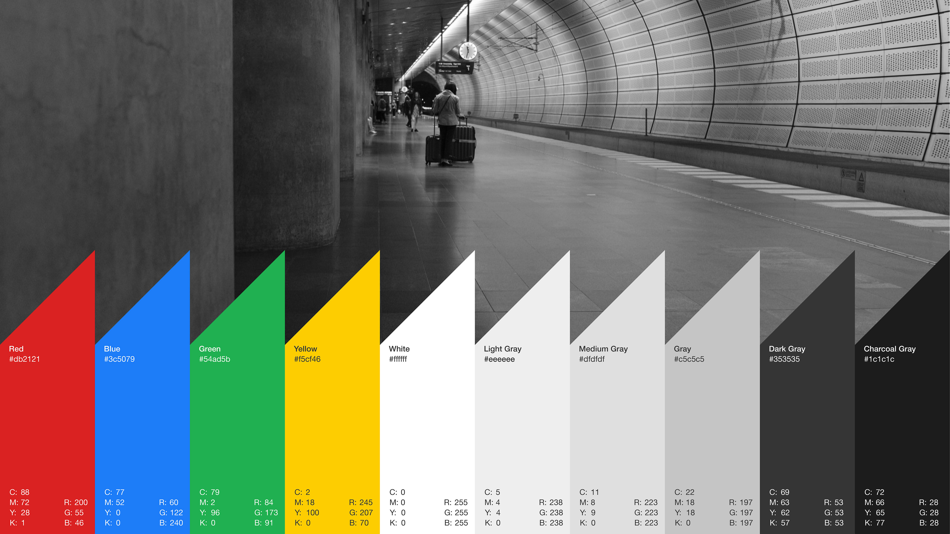
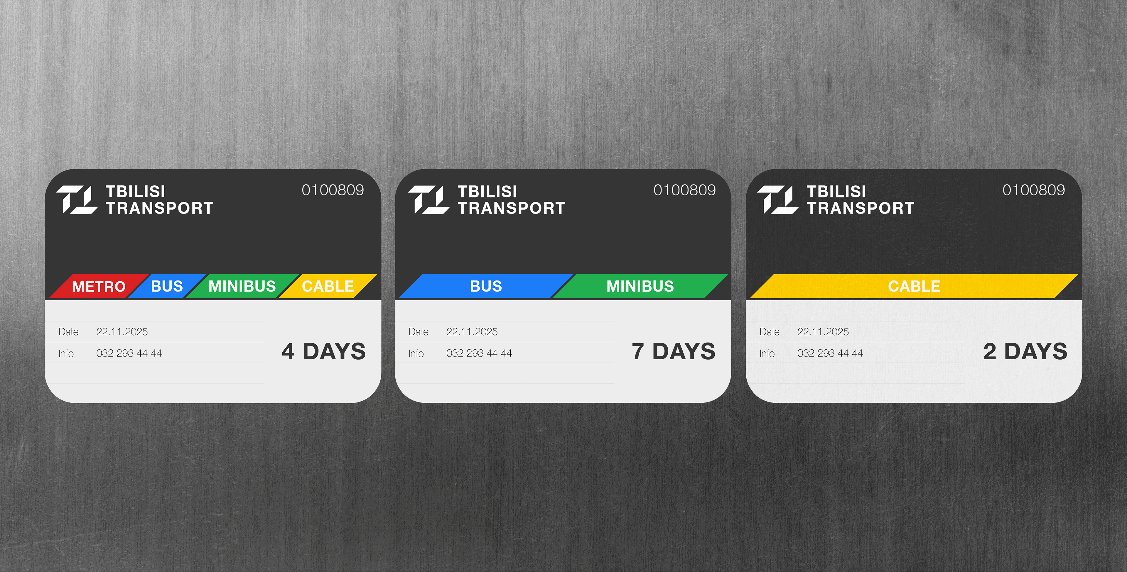
A color system of red, blue, green, and yellow defines the visual logic, inspired by the city’s diverse transport lines and everyday urban energy. Together with clean typography and a structured grid, the identity expresses movement, accessibility, and modernity, reflecting Tbilisi as a city in motion.
This project was developed under the mentorship of Mariam Gogiashvili within the Tbilisi School of Communication, as part of a design course exploring urban identity and public visual systems.